The modern internet is very good at asking us to hurry.
Open a tab and there is always something new to react to, compare against, optimize, save, skim, or forget. Everything arrives with a metric attached. Views, likes, impressions, rankings, open rates, reading time. Even our quietest ideas can start to feel like they are standing in line for performance review.
But the best parts of the web have never felt fast to me.
They feel handmade. They feel specific. They feel like someone opened a door, cleared a table, and left a lamp on.
That is the internet I keep wanting to return to.
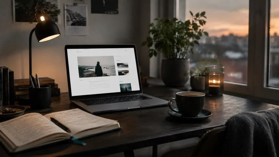
A Website Can Be a Room
A good website does not need to announce itself loudly. It can simply make space.
Space for an essay that takes longer than three minutes to read. Space for a photograph with a proper caption. Space for a note that does not need to become a thread, a carousel, or a campaign. Space for a person’s taste to become visible through small decisions.
The typeface.
The margins.
The rhythm of the archive.
The way links are named.
The absence of a popup at exactly the wrong moment.
These details are not decoration. They are manners.
The best websites feel less like broadcasts and more like rooms someone has thoughtfully prepared.
Slowness Is Not Nostalgia
Designing a slower internet does not mean pretending the old web was perfect. It was messy, inaccessible in places, difficult to maintain, and full of its own bad habits.
Slowness is not about going backward.
It is about choosing what deserves attention.
A slower website can still be modern, responsive, searchable, and beautifully engineered. It can still have newsletters, memberships, analytics, and good performance. The difference is in the posture. It does not treat every visitor like a conversion event. It treats them like a reader.
That shift changes everything.
What Slower Design Looks Like
A slower website often begins with restraint.
It gives the reader a clear path instead of ten competing invitations. It lets typography do real work. It uses images because they add meaning, not because an empty rectangle needed filling. It makes navigation understandable. It respects the difference between a button, a link, and a demand.
It also knows when to stop.
Not every section needs a card.
Not every paragraph needs emphasis.
Not every page needs to sell the whole publication from the beginning again.
Sometimes the most confident design choice is allowing the content to stand there quietly.
Tools Should Disappear
The tools we use to publish shape the work we make. A good publishing system should help us write, edit, organize, and send without constantly reminding us of itself.
This is why I like small, focused workflows. A place for drafts. A place for notes. A place for finished work. A publishing tool that gets out of the way once the sentence is ready.
The goal is not to build a perfect machine. The goal is to build a practice that survives normal life.
The Independent Web Still Matters
There is something quietly radical about owning a small website.
Not because everyone must have one. Not because social platforms are useless. But because a personal site gives shape to your work in a way rented timelines rarely can. It lets ideas accumulate. It lets old posts remain findable. It lets your archive become more than a feed that forgets itself every morning.
A website is one of the few digital places where a person can still create context.
That context matters.
It says: this is what I care about. This is how I arrange my thoughts. This is what I want to keep.
A Better Kind of Attention
The slower internet is not a single aesthetic. It is not only minimalism, serif typography, muted colors, or nostalgic blogrolls.
It is a way of designing for attention with care.
It asks:
- Does this page help the reader understand where they are?
- Is this interaction necessary?
- Does this image carry meaning?
- Is the writing allowed to breathe?
- Would I enjoy spending time here if I arrived as a stranger?
Those questions are small, but they lead somewhere better.
The web does not need every site to be quiet. There is room for noise, play, speed, spectacle, and strange experiments. That variety is part of what makes the internet worth keeping.
But I want more places that feel considered.
More essays with edges.
More homepages with personality.
More archives worth wandering.
More websites that remember a reader is not a target, but a person.
That is the slower internet I am interested in designing for.
And maybe, slowly, writing toward.